CHICAGO BULLS
Current Uniforms: From logo to uniform the Bulls are as static as they come. The franchise doesn’t even mess with a secondary logo, it has had the same bull look since its inception in 1966. Thanks to the Jordan and the 90s the Bulls jersey is ubiquitous around the world, and probably subject to more scrutiny than most, if something were to be fundamentally altered with the uniform. Thus, no need to mess with a classic look. That is the best part about the NBA; the special edition uniforms allow franchises to experiment with new, bold ideas without changing a core set. All of this preamble to say that the Bulls uniforms are terrific. Red looks sharp on a white base, the piping is unobtrusive around the jersey while the spade style patch on the shorts houses the logo in a way that stands out, but not to the detriment of the look…The road reds do have the name in white font on the back, maybe it’s nostalgia speaking but I think a return to the black font trimmed in white (to match the number) plays better. Score: 9.7
Special Editions: The Bulls have anchored their City Edition uniforms around the city flag, which is really cool in theory but the execution hasn’t combined the conceptual elements that make the flag a great design to work around. Here is a side by side of the first two years of the City Edition Uniform.
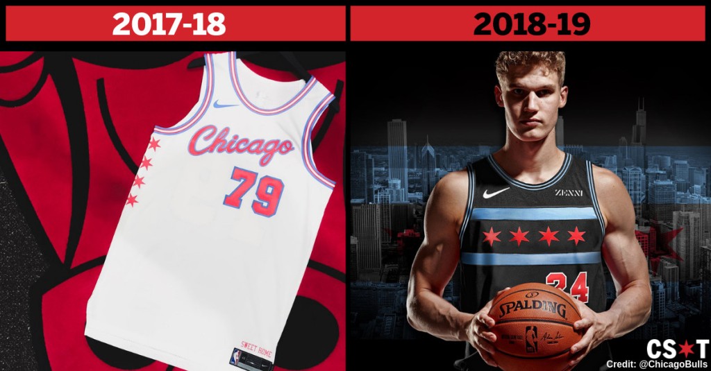
The white base is okay but the flag isn’t represented well. Last year the iconic flag pattern was there but on a black background. Why not throw the flag pattern on the white jersey, thus a true representation of the Chicago flag? That would have been great, really anything would have been better than the design for this season. Holy Eiffel 65 are these uniforms something. That is a lot of blue, AND I LOVE BLUE, but that swallows up everything else. The main part of the jersey, the Bulls logo is camouflaged, and that hurts what actually could be a pretty good design…Chicago did unveil a Statement Edition uniform as well, a near replica of the famous black alternate unis. These are sharp, although a couple of modern changes have lessened the look. The double red piping around the jersey is somewhat unnecessary while a red patch for the Bulls logo on the shorts is a glaring blemish on the black shorts. I do like the “Chicago” wordmark; the franchise has had “Bulls” on the front of every uniform for awhile now. Score: 7.3
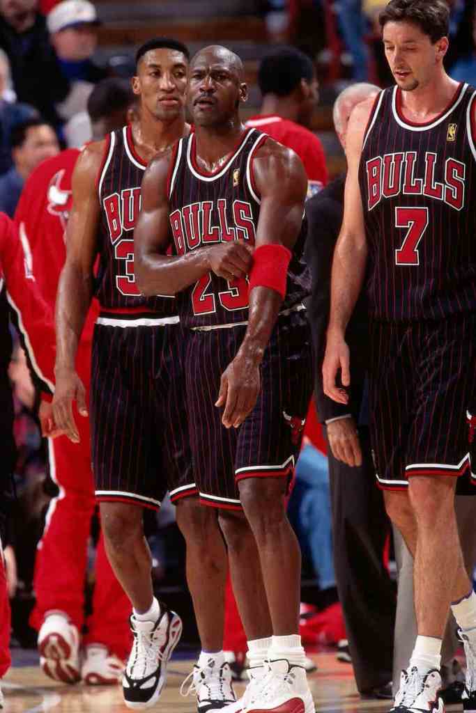
Best Set: It might violate uniform code to choose an alternate uniform as the best selection for a franchise but the pinstripe, black uniforms of the 90s were an aesthetic wonder. First introduced in the 1995-’96 season, (no wonder they won 72 games that year!) these became synonymous with winning. From strictly a pleasing to the eye standpoint they are good, regardless of history in them. Red font on the names, wordmark, and numbers look great on a black base, much better than black font on a red backdrop, and the red and white jersey piping is carried out in a classic style on the shorts as well. Throw in red pinstripes to add a dash of personality and it makes for a distinct, enviable look. Score: 9.8
Overall Score: 8.9
CLEVELAND CAVALIERS
Kim Klement – USA TODAY Sports 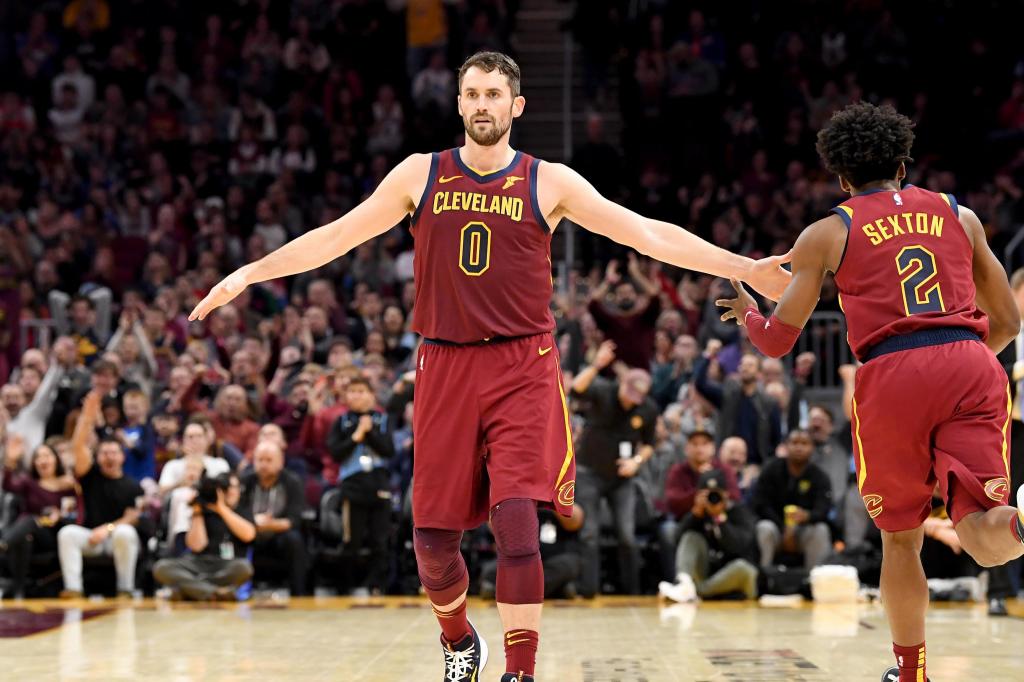
Jason Miller – Getty Images
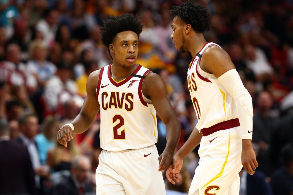
Current Uniforms: The Cavaliers have cycled through a myriad of base uniform sets (12 road and 11 home uniforms!) since their foray into the NBA 50 years ago. The color scheme has stayed the same since 2010-2011 with the wine and gold combo of old. The most recent change came with the changing of the “C” on the jersey to fit in with the wine look and the “Cavs” wordmark on the white uniform. Call that color gold if you want, if certainly looks like yellow to me, doesn’t really seem necessary on the white uniforms. I like utilizing “Cavs” instead of the long wording of Cleveland but a dark shade of red goes well on its own with a white base. On the wine uniforms you run into an issue if everything is yellow so the Cavs added a dark blue as a buffer. The number shades well, especially in yellow trim, but to have it as piping around the jersey is overkill, especially when “Cleveland” needs all the space it can get as a stretched out wordmark. Score: 6.7
Special Editions: Cleveland pulled out a couple of new uniforms to help celebrate their 50th season in the NBA. This year’s City Edition decided to essentially jam together a bunch of elements from every single uniform they have worn. A “throw everything together” works at Golden Corral or a self serve ice cream shop, but there is no place for it on a uniform. The hashmarks down the sides are the biggest transgressor in distracting from a unique jersey front featuring the gold script “CLE” feathered design. The navy/gold color scheme is terrific, and these actually aren’t as bad as the hashmarks want them to be.
50 years as a franchise, 25 years since one of the unique uniform phases in Cavs history. The Classic Edition hits on the wonderful 90s identity of bold looks. Powder blue certainly pops on a black base, but there is kind of a lot of it…like you didn’t have to empty the entire paint can on the shorts much. The orange wordmark stands out well, and it is an interesting number font to wrap your head around. A lot to like, just too much blue all the way around.
Statement Edition has been the same since 2017, basically just a normal version of the black uniforms with sleeves. There might be some truth to the axiom “look good, feel good, play good” because this is the Cavaliers best look of their current uniforms. The wine shade of red pops off the all-black unis, and is much more manageable as a color then when it comprises the entirety of the uniform. This look also eliminates the need for an extraneous color, simply keeping the wine as the jersey piping. The yellow trim on the numbers and stripe on the shorts are also a suitable amount of splash. Score: 8.2
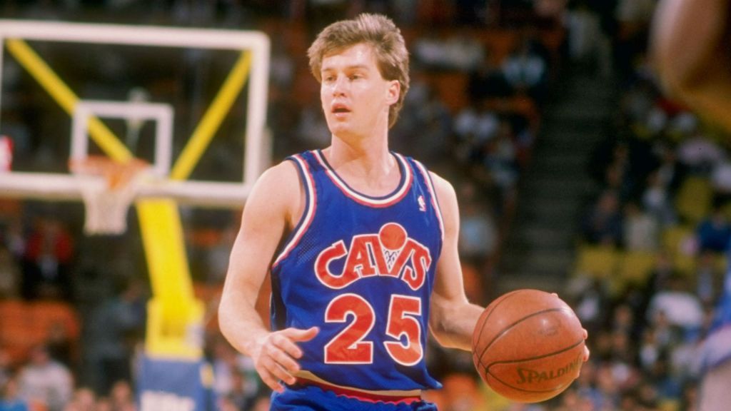
Best Set: I went to Mark Price’s Twitter account as a jumping off point in trying to narrow down a few of the many looks the Cavaliers have worn.
It actually was pretty helpful! The blue stripers are the boldest choice, but the best look was always going to come down to one of the variations involving the basketball “V” on the jersey. I finally settled on the blue uniform with the orange wordmark and jersey number. A classic, top of the line in eyesight pleasurability orange/blue color scheme is enhanced by the unique logo incorporated into the “Cavs” wordmark. No messing around with anything crazy on the jersey or shorts either. Orange and white piping up top, the same pattern mirrored in horizontal stripes on the bottom. Score: 8.8
Overall Score: 7.9
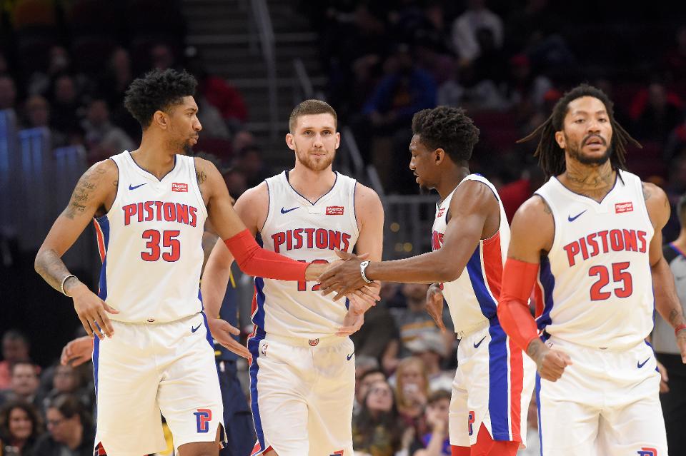
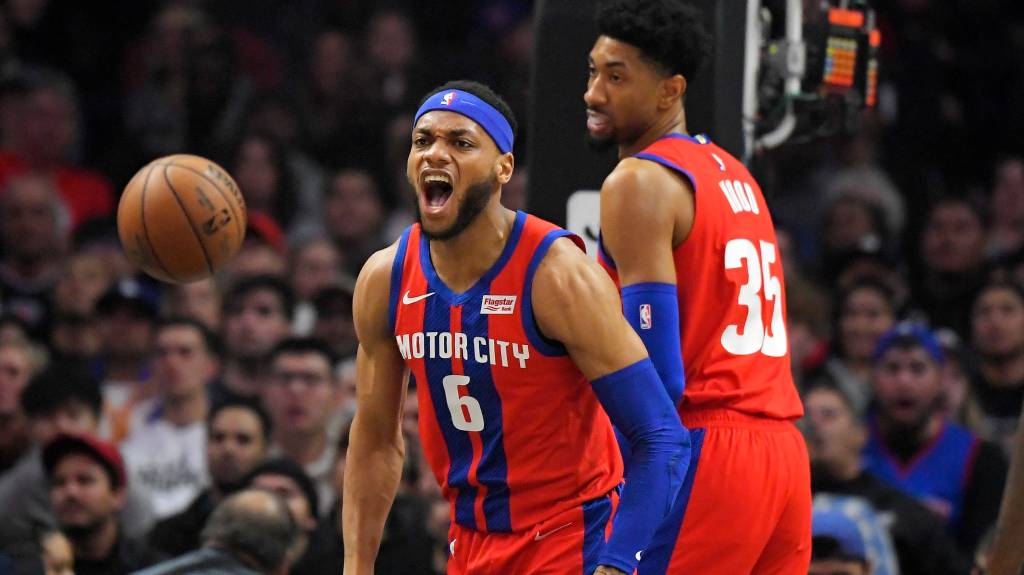
DETROIT PISTONS
Jason Miller – Getty Images 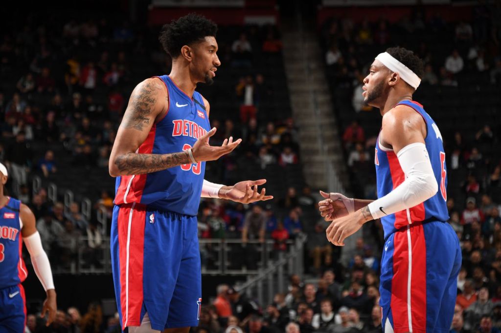
Chris Schwegler – Getty Images
Current Uniforms: Save for the brief period in the late 90s, when everyone was trying to go for bold and ostentatious, the Pistons have stayed with their blue/red color scheme throughout the history of the franchise. It is a nice complement of colors, but the current looks are undermined by the matching jersey/shorts designs down the side. Patterns look better on the side panels of an NFL jersey because there is more space, the minimal canvas between armpit down to the shorts minimizes the need for a lot, if anything on the side panel of an NBA jersey. The two thick stripes on the white uniform are invasive, and the thick red with white stripe fit well on the shorts but are an unnecessary addition to the jersey of the blue set. Otherwise the red font on the team name and number looks equally good on both sets. Score: 8.1
Special Editions: After a couple of misses with the City Edition uniforms the Pistons hit on a successful design this year. They kept the “Motor City” motif which has been the focus of their previous two versions, but this time decided to utilize the team colors instead of a black or navy look. The vertical blue stripes do give the impression of racing stripes and pop well on a red base but between that, the collar piping, name and number, there is a lot going on. The flared blue stripes down the shorts are a nice change from the usual pattern. There is something a bit off-putting and impermanent about the all white font on the names and numbers. A blue trim, especially on the back of the jersey might work wonders. Score: 7.8
Best Set: There isn’t much of a difference between the Pistons uniforms of the mid 2000s to the uniforms of today. The worst addition is the side panel stripes. Hearken back to a simpler time when these sharp blue uniforms did not have anything muddying the design on the jersey. The blue and red look has always been the best, with the way the red font sits on the royal blue background, and this look does the best job showing off that color scheme. Score: 8.5
Overall Score: 8.1
INDIANA PACERS
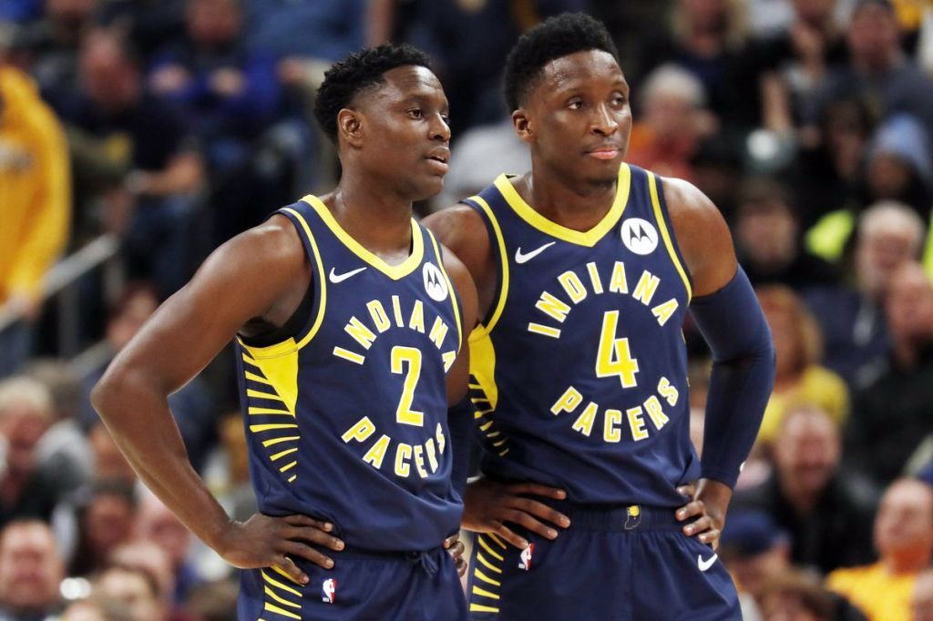
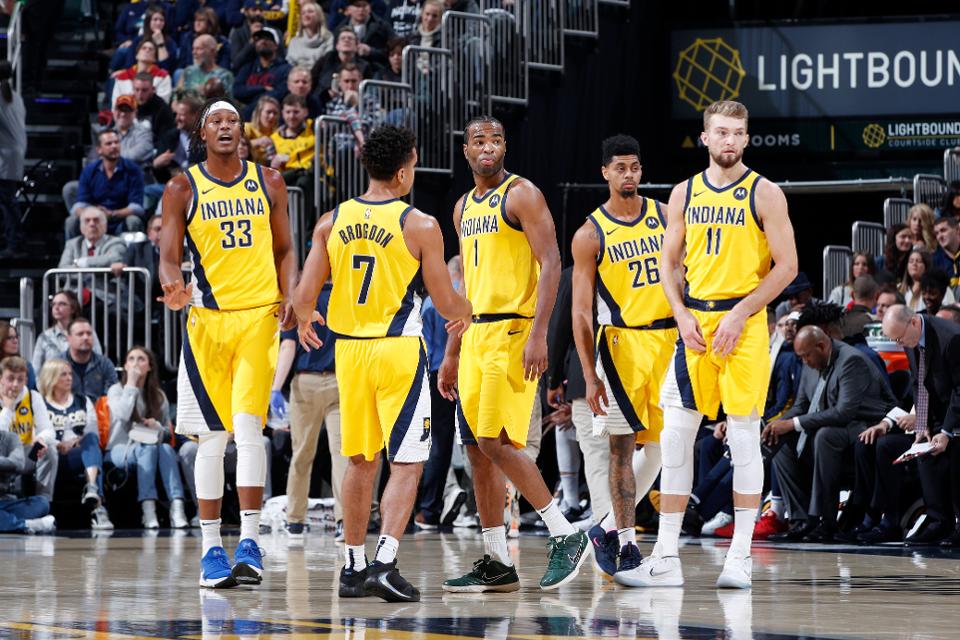
Current Uniforms: I’m intimately familiar with the Pacers and their rich array of unique uniform designs. For a kid growing up in Indiana in the 90s it was impossible to not be aware of the team, during the most prolonged era of success in franchise history. Thus, the move away from the standalone “P” logo and the emphasis on the circular design of everything has been disheartening. The color scheme continues to be great, dark blue and yellow are sharp…and remind me of my elementary school (what up, Klondike!), but the rest of the uniform is a puzzle. The circular design of the team name on the front draws the eye right to the number but then leaves the wordmark as the floating boundary. The hashmarks down the side seem to be there in order to pull some focus away from the hypnotic circle of the jersey. All of this looks more out of place on the white uniform, where yellow trim was added to the blue font and the yellow hashmarks thrown on top of a blue base, which then is thrown on top of the white uniform. Score: 6.0
Special Editions: The Pacers had new City Edition and Statement Edition uniforms this year, drawing on Indiana roots to compile two pretty strong looks. The Statement Edition pulls on the diagonal stripe pattern that was popular during much of the 90s (although back then the Pacers never had a gold version of this look). It is a clean design, and the secondary logo’s incorporation onto the white expanse of the shorts is a subtle way to strengthen the uniform. For the City Edition, a similar style to a racing them from two years ago, but a change of colors. The blue checkerboard stripe down the side makes for a sleek pattern, along with the Indy Car style number on the front. A team name in vertical font unfortunately never works well, but the white uniform serves as a great backdrop for the design. The old Pacers logo on the shorts is also an improvement. Score: 8.4
Joe Robbins – Getty Images 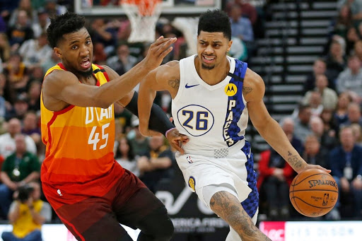
Rick Bowmer – AP
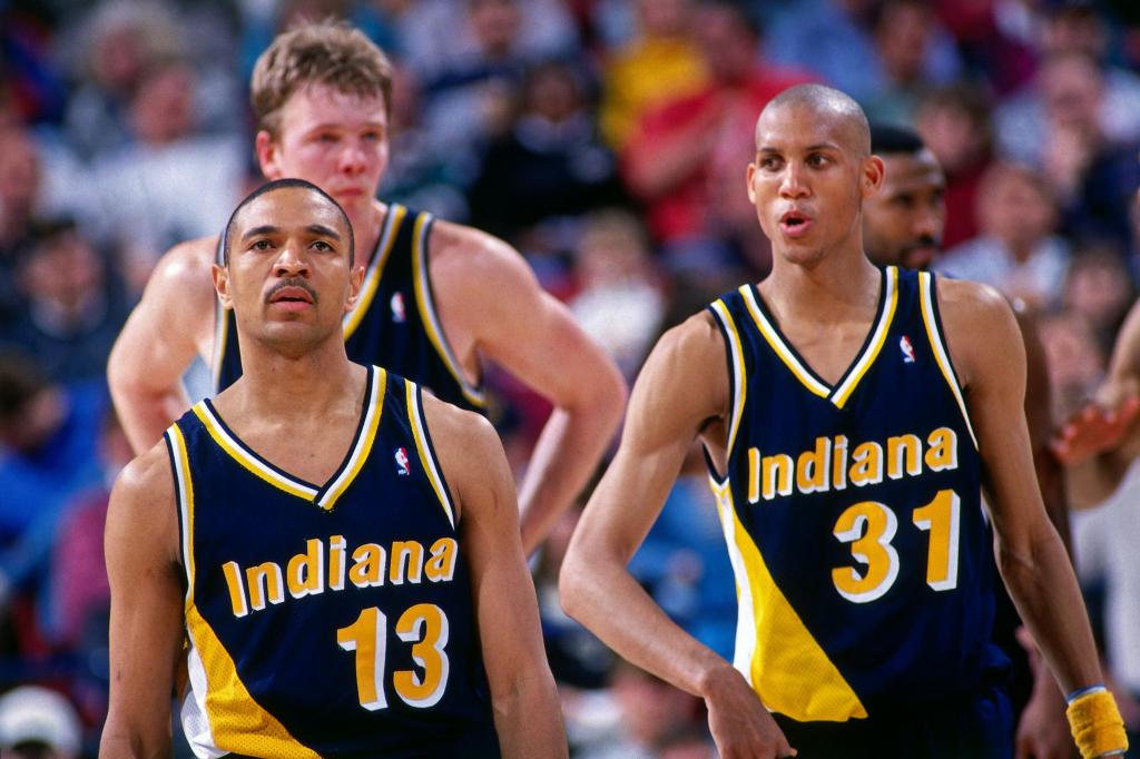
Best Set: The blue pinstripes were a close second but the definitive and best look of the Indiana Pacers are the Flo-Jo uniforms worn for much of the 90s. The team name and number are sharp on the blue jersey, helped out by the drop shadow to pop a little more, while the diagonal stripes (triangle or whatever you want to call that design) make for a unique look. The white and gold piping also add subtle contrast to the rest of the jersey. Score: 9.2
Overall Score: 7.9
MILWAUKEE BUCKS
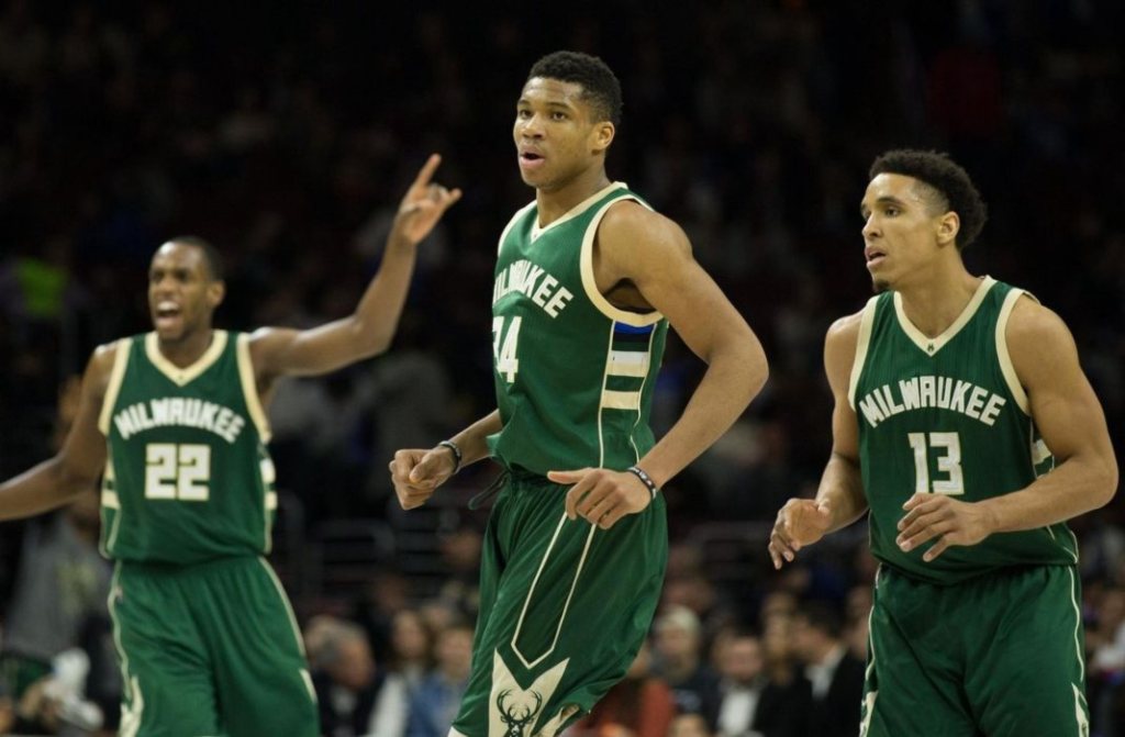
Current Uniforms: The Bucks have never really had great uniforms, highlighted by the identity crisis in finding a suitable color scheme. There was red/green, green/green/white, purple/green, green with red accents, and finally the current green/white motif. These uniforms are plain, which should not be confused for minimalist. The latter often is done intentionally highlight a design element, or because the style worked well for a uniform back when it was conceived. There are a lot of solitary white elements on the road uniforms, monochrome piping and simply white font for names and numbers. I like the logo on the shorts but on the green set the design is puzzling: is that indicating a pocket, or a big tab to label dividers? The road uniforms are better due to green being able to pop on a white background. In this font style the “Bucks” wordmark plays much better than “Milwaukee” stretched across the front of the jersey. Score: 5.7
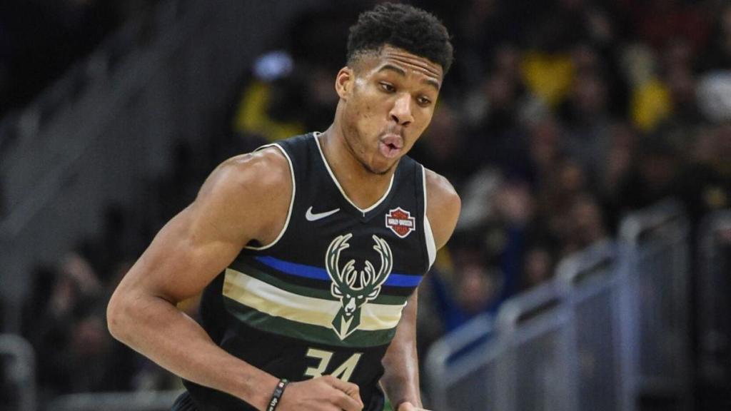
Special Editions: The colorful and polarizing MECCA uniforms from 2018-2019 are gone, replaced with a more traditional and stylish look for the City Edition uniform. The font style is terrific, (give me a script look over block typeface any day) and the subtle green/blue plays out well throughout the rest of the white/cream base with the piping and trim on the number. The shorts also reflect the blue and green pattern with horizontal stripes towards the bottom and the unique “M” look…The Bucks also went with a new Statement Edition uniform, which combined the previous elements of City and Statement edition unis for this design. Notably, the numbers had been encircled by the deer antlers on a previous Statement Edition; the move beneath the stripes is an upgrade. Black uniforms look sharp when there is enough color to highlight the palette, and the multi-colored stripes and logo achieve that here. The ambiguous, almost inverted “M” pattern on the shorts is a blemish on a pretty sharp design. Score: 7.7
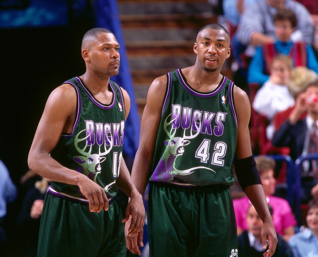
Best Set: It’s obvious what decade these come from: the unrestrained, bold, and charismatic designs of the 1990s. What was your team doing if it didn’t have some kind of logo taking up most of the front of the jersey? From a serious standpoint though, purple and green is really sharp when executed well. The gradient in the “Bucks” wordmark actually looks pretty good, with the white more subtle than the purple. The big ole buck is prominent but the rest of the uniform is very clean and minimally invasive to help offset that logo. Score: 8.0
Overall Score: 7.1

You were very kind to the Bulls – “aesthetic wonder” for the black/red uniforms – impressive phrase!
Some of the Cavs & Bucks uniforms were awful!
LikeLike